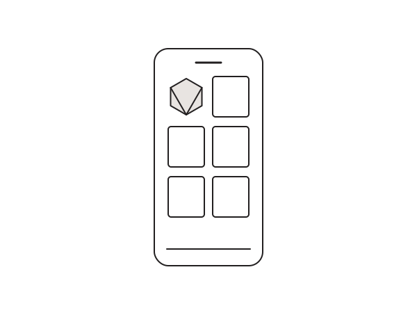
By default WooCommerce often drops to a single column of products on mobile, which makes a shop feel endless and pushes everything below the fold. Showing two columns on phones is a small CSS change that makes the catalogue feel like a real store. Here is the snippet I use, cleaned up from the original and still working in 2026.
The CSS
This targets small screens and forces the product grid to two columns. Add it in Elementor > Site Settings > Custom CSS (Pro), or under Appearance > Customize > Additional CSS if you prefer the theme customizer.
@media only screen and (max-width: 736px) {
  .woocommerce ul.products li.product {
    width: 49%;
    margin: 0 2% 2% 0;
  }
  .woocommerce ul.products li.product:nth-of-type(2n) {
    margin-right: 0;
  }
  .woocommerce ul.products.columns-3 li.product:nth-of-type(3n+1) {
    clear: none;
  }
  .woocommerce ul.products.columns-3 li.product:nth-of-type(2n+1) {
    clear: both;
  }
}
Two things to watch
First, the columns-3 class in the selector assumes your desktop grid is three columns. If yours is set to four, swap it for columns-4 so the clearing rules line up. Second, two columns can get tight on very small phones. Test on a 360px-wide screen, and if titles or prices wrap badly, nudge the breakpoint or the width. The original version of this snippet had a small typo in one selector; the code above is the corrected, tidied version.
If you are theming a WooCommerce shop in Elementor and want it to feel right on every screen size, that responsive polish is exactly the kind of detail worth a second pair of eyes. Ask me anything.